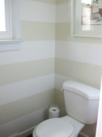
For example, I made the mistake of mentioning that I wanted to do a similar striped treatment in a bathroom that John and Sherry did in their old house to a few family members a month ago and they all decided they wanted to do it too. This was also all said before a zillion other bloggers did it. So now I am NOT going to do that and I won't be discussing plans anywhere else but here (not many family members keep up with this blog). Although saying that, I don't think they have the balls to do a striped wall. They're not easy.
So with that in mind, I've sat down to write about the paint colors we're considering in the new house many different times but I always ditch the post because I don't want to be copied or see someone take my whole house color scheme and run with it.
Now that I've thought about it though (for months since I've been waiting to own the dang house for-ever), I realized that I don't care if internet people know, most likely the paint colors wouldn't work together in any house but mine since lighting and size play such important roles. The thing that truly would bug me is if real life friends did it and then I had to visit them in their mimicry house. So, here goes. And know that if you blatantly rip off me I'll come to your house in the middle of the night and place Timmantha in bed beside you. You really don't want that ;)
We've discussed house paint before (here), but I'll say it again. I hate tan and builders beige, it looks like the walls are weeping with boredom when I see entire houses of beige blah-ness. I also dislike brown, it looks like poop smeared on walls, NOT chocolate, unless it's poopy chocolate. In contrast, Rob also dislikes white and cold grays as well as ivories, tans, and browns. Basically the only neutral we can agree on is warm grays and black. BUT we like to paint furniture in those tones so the house would again start weeping from looking like a dark cave. All that to say that there won't be normal neutrals on the walls in this house, sorry if that breaks some sort of design code, it's just not our bag.
Instead, we're leaning into the airy gray blues and gray greens with a few shocks of moody stormy blues. We basically already have the living room and kitchen color set in stone (although we'll still sample it. If it looks dumb obviously I'll moan on here and try again). We really love Benjamin Moore's Gray Cashmere.
I have no clue why it looks so blue online. It reads more as a blue green color in real life. Here are some examples I've found online via just google images. Also, does anyone else have issues with Decorati.com? It always tries to give me viruses, grrr.
Love it. It looks so warm with wood tones too. We're planning on painting the living room, hall, kitchen, stairwell and upstairs hall with it as well. We might cut the paint in half outside of the living room though, the stairs and kitchen don't have windows so we don't want them to get dark. Maybe not though, the paint swatch lighter than Gray Cashmere looks so washed out and blah.
For whole house trim we're planning on using Honeymilk by Valspar. I'm not going to put the official valspar picture of it up because it looks pink on the internet and in person, the paint card itself looks very yellow. In real life, Honeymilk is a gorgeously complex milky color. It's like the old ipods. Remember the milky white depth they had? We used Honeymilk on our dining room table if you remember,
That table, by the way, will look glorious against Gray Cashmere (since we have no dining room the table is going to go into a corner of the living room). Anyways, we're planning on using Honeymilk for our mill work as well as the mismatched wood kitchen cabinets.
And if you hold Gray Cashmere and Honeymilk up against the chestnut flooring they look amazing!!! :) So excited.
So that's the plan for the living room and open areas of the house. Bedroom paint colors, mancave, and bathroom colors coming up!


The color is lovely! It does look great with the wood floors.
ReplyDeleteIt's funny, because I'm pretty much the opposite of you with regards to doing what others do. Because the blogosphere is so huge and fragmented, I have realized that even if I do the same thing that "everyone" does online, it's totally hip and new amongst my friends and family. So, it still feels fresh.
And I actually feel really honored and excited when someone wants to do something "exactly" like I've done it. When I painted our last living/dining rooms in a color called Stoney Creek, no less than 3 of my family members painted rooms in the same color. The same thing happened with the dining room paint color in our new house and our kitchen color. It's so funny and I love it! Everything looks so different with other homes/things/light that you really wouldn't know anyhow.
Anyways, I'm not saying one way is right or wrong because I actually don't think there is a right or wrong, I just think it's fascinating that we have totally different perspectives. And I can see where you're coming from totally. And I love the paint color.
Oh my goodness - I think we truly have exactly the same taste in colours!!! I wish we had Benjamin Moore in England. Have you checked out Farrow and Ball's paints? I think you'd truly love them. Light Blue, Blue Gray and Pigeon especially. SOooo lovely!!
ReplyDeleteSarahx