__________
Next up in the paint planning is the guest room. This will probably be one of the first rooms we do paint, since we have some guests that are flying in October the 13th to stay for two weeks. If you do the math, that means we have ONE weekend (and 7 ish days) in between closing and them coming to rip up the manky carpet and attempt some paint. It'll be okay though, the house is completely liveable now (bathrooms and kitchen are sparking clean aside from the grotty oven). And they know their room won't be show room perfect. Although it will have perfect flooring dangit. That carpet is nasty. I think it's doable though if we get a few friends to help!
Anyways, I think new flooring and a fresh paint job will be plenty to make the room fill homey (well that and a bed). We already have bed linens and pillows. :) Whew, on to the pretty pictures and paint possibilities!
(I don't know why this one is smaller?)
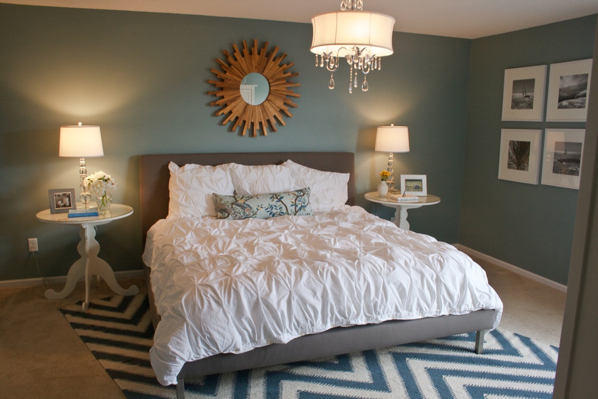
I think the Handmade Home first linked this but I can't remember. Anyways, I love it and it's the main inspiration for the guest room! It's the opposite of Rob's mancave since it's so fresh and light. The problem is that this room is painted Dix Blue by Farrow and Ball and we cannot get that paint in po' dunk Kentucky. I can't even get a paint chip for it. I can order it but it'd cost a bucket load and I am cheap economical, plus who knows if it'd look good in my room?! It would probably look like I murdered the Jolly Green Giant instead.
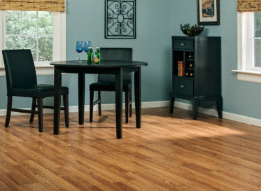
But, it's a starting point right? I also love the feeling of this room:
So I've been discussing this with the local Benjamin Moore guys (it's hilarious how they can't pick a mint color swatch to save their life but they can look at a paint chip online and debate what formula it might have) and we've honed in on two possible mints.
Colony Green by Benjamin Moore
This doesn't look anything like the real swatch.
and North Shore Green by Benjamin Moore
Again, totally wrong.
Here, this is with my phone but it's still closer to what they look like in real life on the swatches.
Closer... sorry, blogger is freaking out. I don't know why it looks like the bottom of this picture has been chewed away?!
Anyhow, both should be a barely minty color and since they're the lightest on the chip they shouldn't be too strong. I don't want it to look like a teenagers room and I definitely don't want it to veer into looking like an aqua. I think aqua is so overdone right now.
I also like Ante Meridian by Valspar. But Valspar's online paint chips are just so insanely off base I won't bother putting it here. It looks purple online for some crazy reason. It's a washed out mint dang it!
I think these light mints paired with some colorful ikat like the inspiration pick or a modern colorful floral in curtains will be nice :) This is MY room by the way, it's my chick cave. Since Rob gets his own room to design and paint how he likes then I get one too! It won't be bubblegum pink with frills, no, but I do want a dash of pink somewhere. And I think mint walls are girly :)


